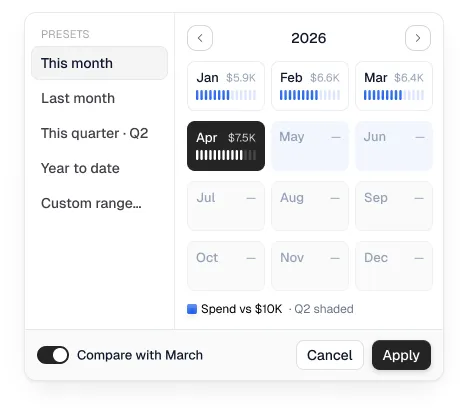
Live preview from the React code. Hover the marks, rows and tabs.
Build it with your agent
Copy the setup prompt once per project, then the prompt for this component. Works with Claude Code, Cursor, VS Code and Codex through the Ingot MCP.
1Set up Ingot UI
Set up Ingot UI in this project.

1. Connect the Ingot UI MCP server by running:
   claude mcp add --scope user --transport http ingot-ui https://mcp.ingotui.com/mcp --header "Authorization: Bearer YOUR_API_KEY"
   Replace YOUR_API_KEY with my key from https://ingotui.com/account (ask me for it if you don't have it).
2. Call the Ingot UI tool init_project for the Spendix system and write every file it returns (token CSS, CLAUDE.md, AGENTS.md, .cursor/rules/ingot.mdc).
3. From now on build UI from Ingot components and the --fu-* tokens, never raw hex colours, and run audit_ui before you finish.
2Build this component
Add the Ingot UI "Period picker popover" (popovers, Spendix system) to this project.

Use the Ingot UI MCP: call get_component_code with slug "spendix-period-picker-popover-3636859" and write the file to the path it returns. Then place it where I need it, keep my existing layout, use the --fu-* tokens for anything new, and run audit_ui when you're done.
Specs
Period picker popover is 223 lines of React with 2 Ingot icons, set in Geist. It needs no packages beyond React, so it works in Next.js, Vite or Remix as pasted, and its colours can be swapped for your Spendix tokens.
- Component
<PeriodPickerPopover />- Size
- 420 × 369 px
- Icons
- Chevron left, Chevron right from Ingot Icons
- Type
- Geist, 11px, 12px, 13px, 14px, Regular and Medium
- Colours
- #ffffff#2563eb#3f76ed#94a3b8#0f172a#fafafa
- Corner radius
- 1px, 2px, 8px, 9px, 9.5px
- Code
- 223 lines of TypeScript, React only, inline styles, icons included
Use it
import { PeriodPickerPopover } from "./period-picker-popover";

export default function Page() {
  return <PeriodPickerPopover />;
}
Accessibility
Notes for all popovers components (category level). Target: WCAG 2.2 AA.
- Keyboard
- Opens from a button; Escape closes and returns focus to it.
- ARIA
- Trigger: aria-expanded and aria-controls. Tooltips must also open on keyboard focus, not hover only.
- Focus
- Interactive popovers take focus on open; tooltips don’t.
Before you ship it
- The generated code draws the design only: <div>s, text and aria-hidden icons, with no buttons, inputs, roles or ARIA. That is why it matches Figma closely, and why you add behaviour when you wire it up.
- Use a popover or tooltip primitive (Loopo Tooltip uses Base UI) rather than toggling visibility yourself.
How we test and what’s known: accessibility statement.