Best dashboard UI kits for 2027: 10 picks for React, Tailwind and Figma
By Wolfpixel7 min read
The best dashboard UI kit is the one whose Figma file and code match, so nothing gets lost between design and build. For a finished look with React code checked against Figma, start with a Ingot UI system: Loopo is free, and the five Pro systems cover newsletters, AI agents, workflow automation, security and business admin. For open-source primitives, use shadcn/ui; for the largest Figma-only kit, Untitled UI; for a free Tailwind admin template, TailAdmin or Flowbite.
Summarize withChatGPTClaudePerplexity
On this page
We are Wolfpixel, the product design studio behind Ingot UI. We design dashboards for SaaS teams every week, and we built the six Ingot systems from those real product screens. That makes us biased, so we will say it plainly: six of the ten picks below are ours. Each one gets the same treatment as the other four: what it is good at, who it is for, and where something else fits better.
Every number in this post is read from the live library at build time, so it is never a marketing round-up. Today the library holds 1,882 components across 6 systems, and 1,731 of them ship with React code that passed a visual check against the Figma original.
How we chose these kits
Most “best UI kit” lists rank by screenshots. Screenshots tell you nothing about what happens on day three, when a developer has to rebuild the card from the Figma file. We weighed four things, in this order:
- 1Design and code parity. Does the Figma component match a real React component, or will someone redraw it in code?
- 2Dashboard depth. Charts, KPI cards, tables, drawers and modals, not just buttons and inputs.
- 3A coherent look. Tokens, type and spacing that hold together when you add your fiftieth screen.
- 4Honest fit. A seed-stage founder and an enterprise design team need different things. Each entry has a “Best for” line; read it first.
The 10 best dashboard UI kits
1. Loopo
Warm analytics, soft surfaces
- In Figma
- 340
- With React code
- 351
- Source screens
- 72
- Charts
- 32
- Plan
- Free
Best for: founders who want a warm, finished analytics look for free, in code and Figma, today.
- The only free system: 30 hand-built React components (tokens, charts, tables, overlays) plus the Loopo Figma library.
- 340 components harvested from 72 real product screens; 321 of them also have generated React code that passed visual QA.
- Seven chart components in code, including capsule bars, a donut and a line with a highlight band. 32 charts in the Figma library.
- Works with
npx ingotui addand the shadcn CLI, so it drops into an existing Tailwind v4 project.
Try:KPI cardCapsule barsData tableAudience growth cardAdd funds modal
Open Loopo2. MailPulse
Violet newsletter growth
- In Figma
- 302
- With React code
- 278
- Source screens
- 68
- Charts
- 22
- Plan
- Pro
Best for: newsletter, creator and email-marketing products that need audience growth, campaign and revenue screens.
- 302 components from 68 screens, 278 with React code.
- Strong on lists and tables (44) and content cards (91): campaigns tables, subscriber profiles, integration cards.
- Distinctive data views such as a send-time heatmap and an engagement funnel.
- Violet accent with dual-tone icons, so it reads as its own product rather than a default theme.
Try:Best time to sendEngagement funnelCampaigns tableSubscriber profile drawer
Open MailPulse3. Auton
Automation control room
- In Figma
- 279
- With React code
- 259
- Source screens
- 71
- Charts
- 58
- Plan
- Pro
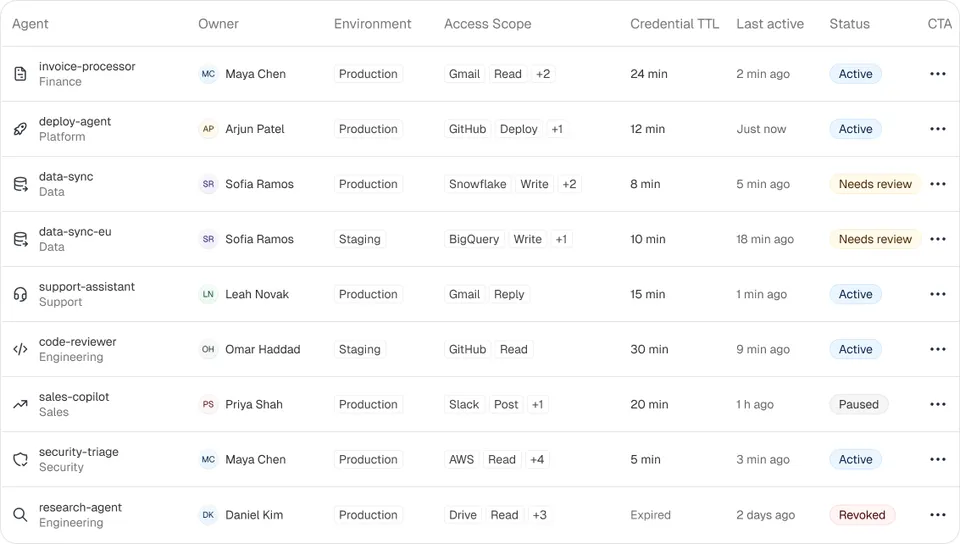
Best for: AI agent platforms and internal tools that need governance screens: agents, access policies, credentials, approvals and audit logs.
- 279 components from 71 screens, 259 with React code.
- The deepest overlay set in the library: 58 modals and 27 drawers, so every “are you sure”, deploy and approval flow is already drawn.
- KPI tiles written for agent operations (registered agents, running now, active policies).
- Blue, calm and dense, which suits admin consoles people keep open all day.
Try:Agents tabledeploy-agent drawerKPI, Running nowCredentials table
Open Auton4. Axon
Dense data, calm chrome
- In Figma
- 292
- With React code
- 257
- Source screens
- 81
- Charts
- 42
- Plan
- Pro
Best for: workflow automation and AI pipeline products: builders, review queues, runs, logs and exceptions.
- 292 components from 81 screens, 257 with React code.
- 81 table and list components, the most of any system: runs tables, review queues, document lists.
- Workflow builder parts (canvas, add-step menu, model menu) that are hard to find in generic kits.
- Teal accent and quiet chrome built for data-dense screens.
Try:Runs tableQueue listExtract invoice fields drawerPause Customer Refunds? modal
Open Axon5. Veriq
Trust and verification
- In Figma
- 255
- With React code
- 236
- Source screens
- 58
- Charts
- 51
- Plan
- Pro
Best for: security, compliance and developer-tool dashboards: vulnerabilities, secrets, attack paths and scans.
- 255 components from 58 screens, 236 with React code (93% of the system).
- 51 charts and 19 navigation parts, including settings navigation and category tabs.
- Tables for endpoints, secrets, packages and members that already carry severity and status.
- Indigo accent with Geist and Inter type for a technical, trustworthy feel.
Try:Secrets tableRun a scan modalEndpoint tableSLA weekly chart
Open Veriq6. Vantage
Admin at a glance
- In Figma
- 384
- With React code
- 350
- Source screens
- 70
- Charts
- 43
- Plan
- Pro
Best for: business admin and finance views: customers, subscriptions, retention, projections and targets.
- The largest system: 384 components from 70 screens, 350 with React code.
- 17 KPI and stats components, the most in the library: KPI strips, mini KPIs, stat cards.
- Retention grids, funnels and net-movement charts for subscription businesses.
- 171 cards and panels, so most admin layouts are assembly rather than design.
Try:KPI stripRetention gridCustomers tableSet a revenue target modal
Open Vantage7. shadcn/ui
Best for: developers who want open-source, copy-in React primitives and are happy to design the dashboard look themselves. shadcn/ui is the default starting point for Tailwind projects, with a large ecosystem of community blocks and Figma kits. It is a foundation, not a finished dashboard: you still decide what your KPI cards, charts and tables look like. Ingot UI components install through the same shadcn CLI, so the two work together rather than compete. We cover this in shadcn/ui alternatives.
8. Untitled UI
Best for: design teams that want a very large, general-purpose Figma kit and a matching React library. Untitled UI covers marketing pages, app screens and dashboards in one neutral style. Choose it when breadth across a whole company matters more than a distinctive dashboard look.
9. TailAdmin
Best for: teams that want a free, complete admin template to fork today. TailAdmin ships page templates for React, Next.js and other stacks on Tailwind, with a Figma file. It is a template rather than a system: great for an internal tool, less suited if you need your product to look like your own.
10. Flowbite
Best for: Tailwind projects that want an open-source component set plus a Figma library that follows Tailwind’s own scale. Flowbite is broad and framework-flexible; its dashboard pieces are general rather than built from one product.
Quick comparison
| Kit | What you get | Code checked against Figma | Price |
|---|---|---|---|
| Loopo | 340 Figma components, 351 in React | Yes for generated code; 30 hand-built | Free |
| MailPulse | 302 Figma, 278 React | Yes | Pro |
| Auton | 279 Figma, 259 React | Yes | Pro |
| Axon | 292 Figma, 257 React | Yes | Pro |
| Veriq | 255 Figma, 236 React | Yes | Pro |
| Vantage | 384 Figma, 350 React | Yes | Pro |
| shadcn/ui | Open-source React primitives and blocks | Not applicable (code first) | Free |
| Untitled UI | Large Figma kit plus React components | Check per component | Free and paid |
| TailAdmin | Admin templates in several frameworks | Check per template | Free and paid |
| Flowbite | Tailwind components and Figma library | Check per component | Free and paid |
How to pick the right kit for your product
Start from your product, not the kit. Write down the five screens your users open most. For most SaaS dashboards that is an overview with KPIs, a list or table, a detail drawer, a settings page and a create or edit modal. Then check each candidate kit for those exact pieces.
- If you are pre-seed and alone, use Loopo or TailAdmin. Free, finished, and fast to ship.
- If your product has a clear domain (email, AI agents, workflows, security, subscriptions), pick the Ingot system built from that domain. You skip designing the specialist screens.
- If you have a designer and want your own look, start from shadcn/ui primitives and build your system on top. Our Tailwind v4 tokens guide shows how.
- If an AI agent writes most of your UI, choose a kit your agent can read. Ingot systems are available through an MCP server, so the agent pulls real components instead of inventing them.
Mistakes that make a UI kit expensive later
- Buying a Figma-only kit and assuming code will be quick. Rebuilding a dense chart card by hand is where most dashboard time goes.
- Mixing two kits. Two radius scales and two grey ramps on one screen is the fastest way to look unfinished.
- Choosing by component count. A kit with fewer pieces that match your screens beats a kit with thousands you will never use.
- Skipping states. Check empty, loading and error states before you commit; many kits only draw the happy path.
Frequently asked questions
What is a dashboard UI kit?
A dashboard UI kit is a set of ready-made interface pieces for data products: navigation, KPI cards, charts, tables, filters, modals and full page templates, usually as a Figma file, code, or both. A good kit also includes design tokens so every piece shares the same colours, type and spacing.
Is there a free dashboard UI kit with React code and Figma?
Yes. The Loopo system in Ingot UI is free and includes 30 hand-built React components plus its Figma library of 340 components, 321 of which also have generated React code checked against Figma. TailAdmin and Flowbite also have free tiers.
Are Ingot UI components compatible with shadcn/ui?
Yes. Free components are published as shadcn registry items, so npx shadcn add works, and they use Tailwind CSS v4 and Base UI for interactive parts.
How many components should a dashboard UI kit have?
Enough to cover your real screens, not a target number. Check for the five screens your users open most (overview, table, detail drawer, settings, create modal) and their empty, loading and error states.
Can I use a dashboard UI kit in a commercial product?
Usually yes, but read the licence. Ingot UI components can be used in unlimited personal and commercial projects; you may not resell the library itself as a UI kit.
About the author
Wolfpixel is the product design studio that designed the six Ingot UI systems from real dashboard projects, and checks every generated React component against its Figma original before it ships. Read more on wolfpixel.agency.