6 SaaS dashboard examples broken down screen by screen
By Wolfpixel4 min read
The best SaaS dashboard examples are built around one daily decision and a short list of supporting screens: an overview, a main table, a detail drawer, create and edit flows, settings and an audit trail. Below are six real examples from different domains, with 420 product screens between them, and what each one teaches.
Summarize withChatGPTClaudePerplexity
On this page
We are Wolfpixel. Inspiration galleries show you hero shots; they rarely show the twentieth screen, which is where a product feels finished or not. These six examples are the product files the Ingot UI systems were built from, so every screen below exists, down to the confirm modal.
What every SaaS dashboard needs
| Screen | Job | Often forgotten |
|---|---|---|
| Overview | Answer “is anything wrong?” in five seconds | A clear comparison on every KPI |
| Main list or table | Find and act on records | Empty, loading and no-results states |
| Detail drawer | Inspect one record without losing your place | Keyboard close and deep links |
| Create and edit | Add work to the system | Validation and success feedback |
| Settings | Team, billing, integrations, security | Danger zone and audit trail |
1. Email and newsletter: MailPulse
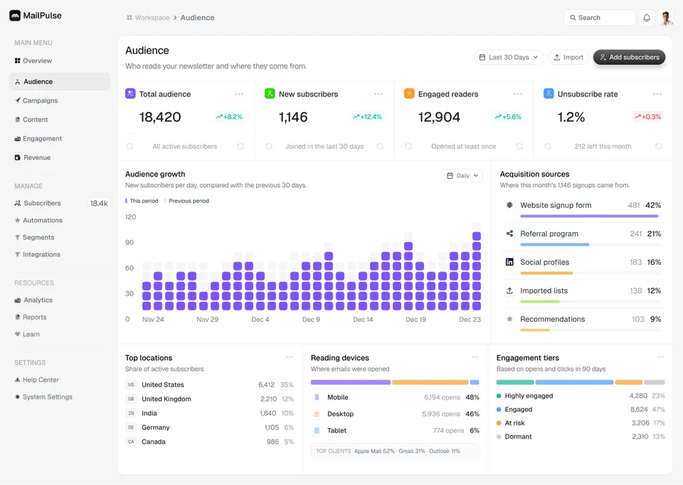
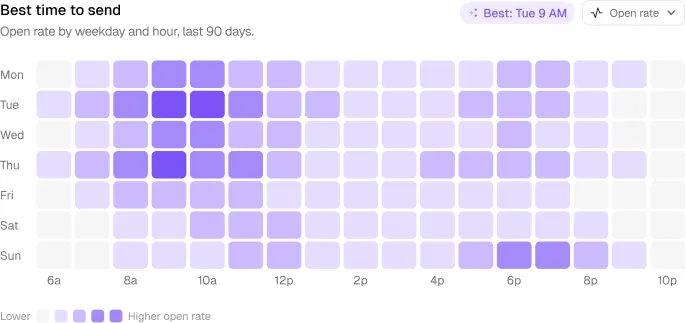
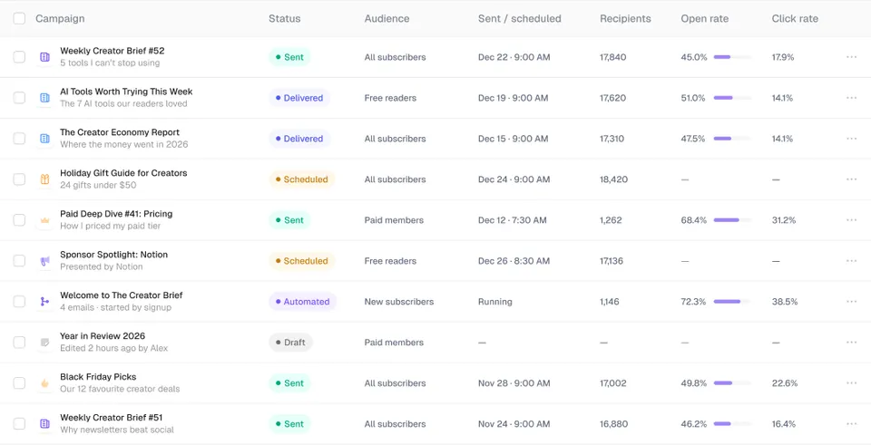
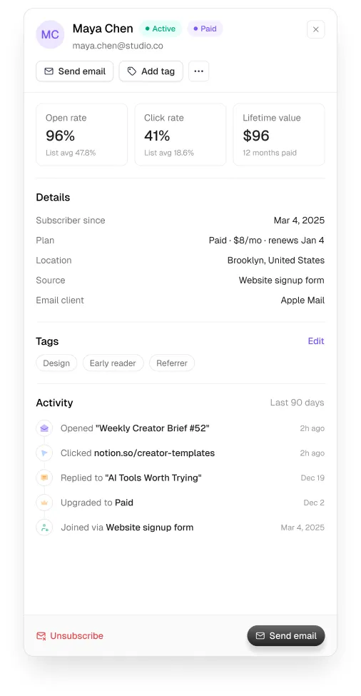
68 screens covering audience, campaigns, automations, segments, engagement, revenue and a help centre. What it does well: it treats content as data. Campaign tables carry status and performance in one row, and timing is shown as a heatmap rather than a table of hours.
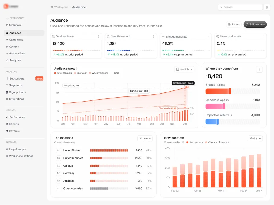
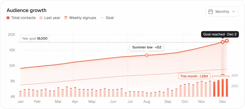
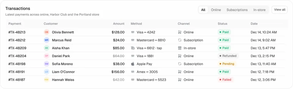
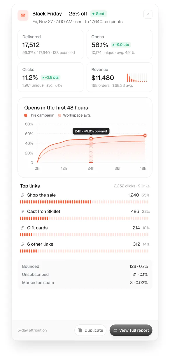
2. Audience and revenue analytics: Loopo
72 screens from overview to signup forms, integrations, performance and revenue. What it does well: warm, soft surfaces that keep a dense analytics product calm, and capsule bar charts that read at a glance. It is the free system, so you can study and copy it today.
3. AI agent governance: Auton
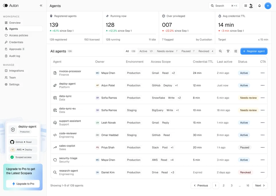
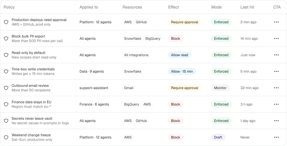
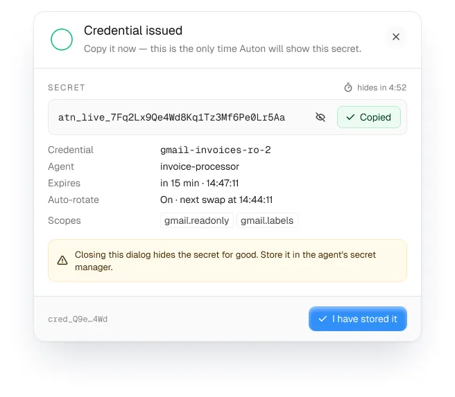
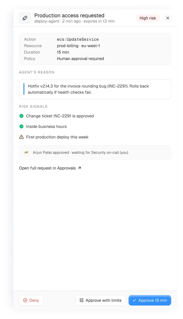
71 screens for agents, access policies, credentials, approvals, audit log, integrations and team. What it does well: high-stakes actions are slowed down on purpose. Deploys, credential issues and policy changes each have their own drawer or confirm modal, so nothing important happens from a single click.
4. Workflow automation: Axon
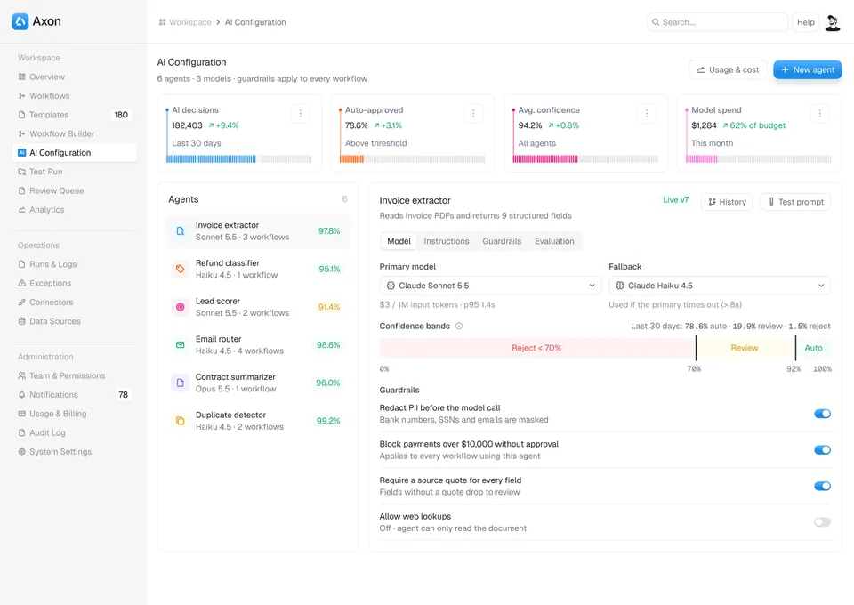
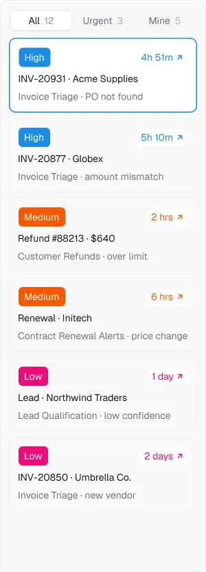
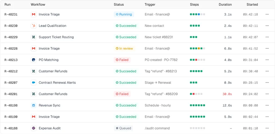
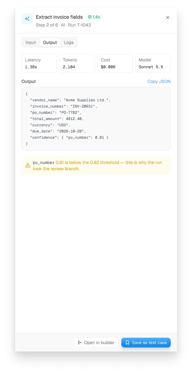
81 screens across workflows, templates, the builder, AI configuration, test runs, review queue, runs and logs, exceptions, connectors and usage billing. What it does well: it separates building, running and reviewing, so each screen has one job. The review queue and exceptions views are the parts generic kits never have.
5. Security and compliance: Veriq
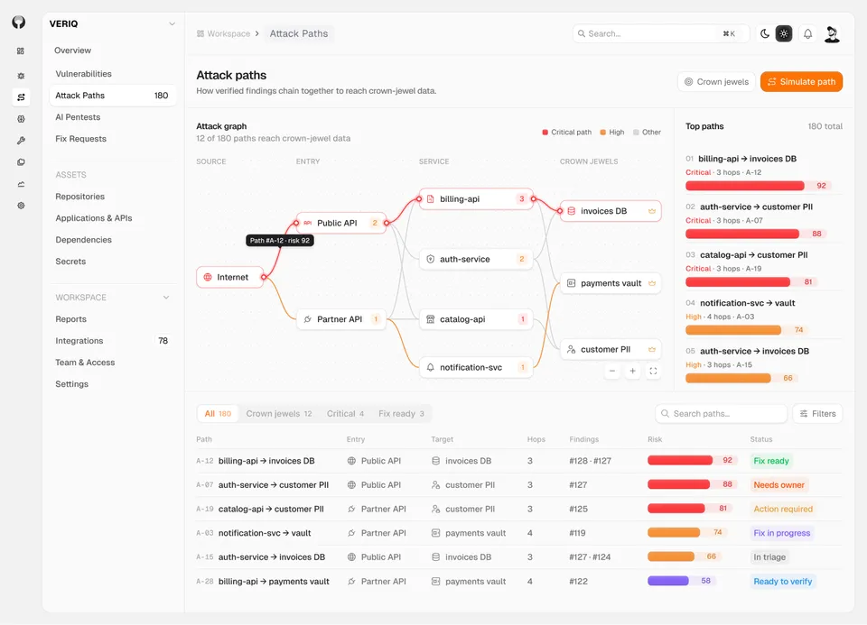
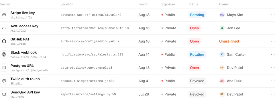
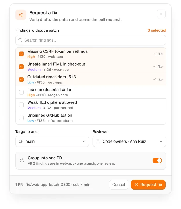
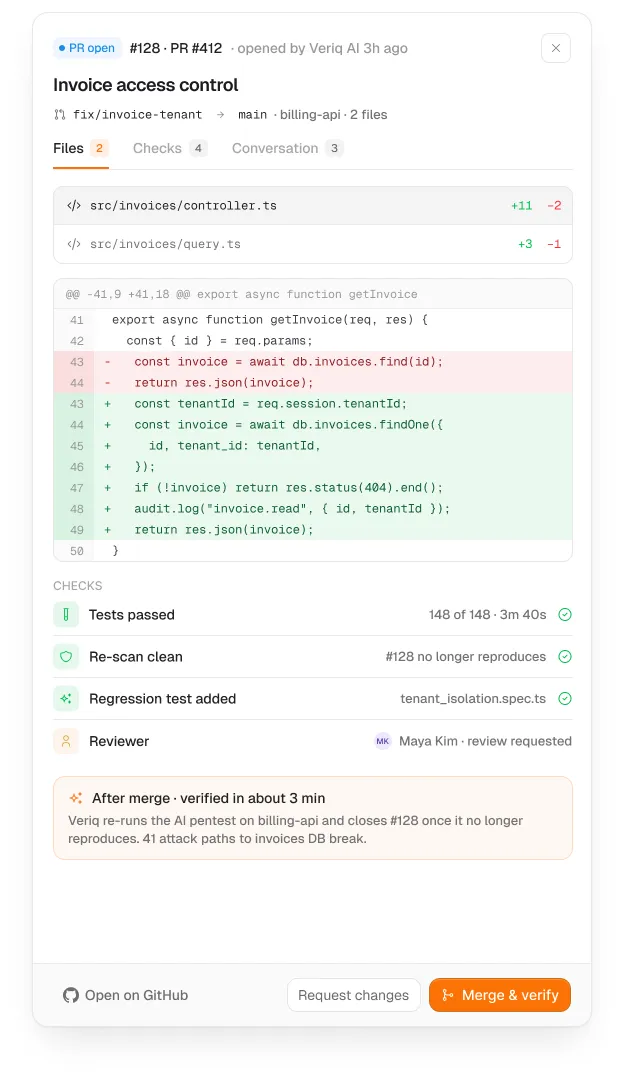
58 screens for vulnerabilities, secrets, attack paths, repositories, dependencies, AI pentests, reports and team access. What it does well: severity is a first-class visual element, and every finding has a path to a fix (request a fix, open a PR) instead of ending at a red badge.
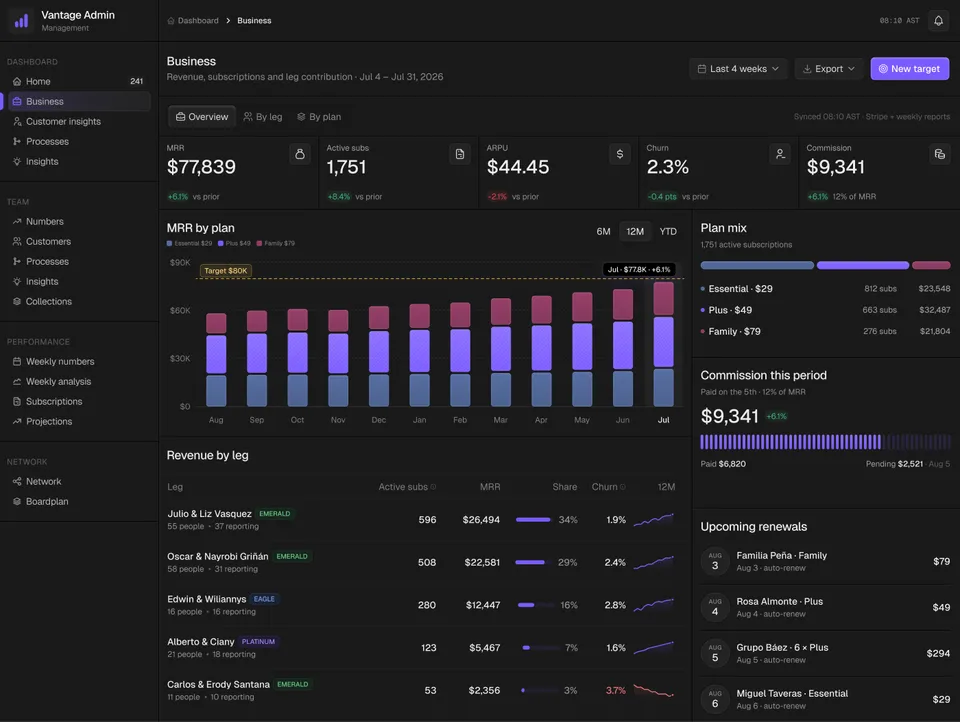
6. Business admin and subscriptions: Vantage
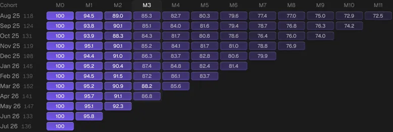
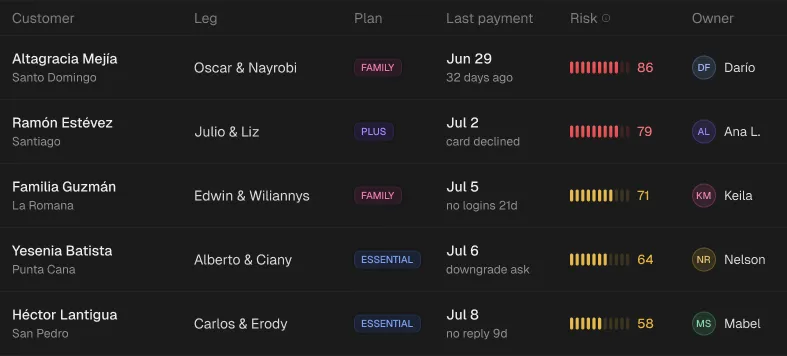
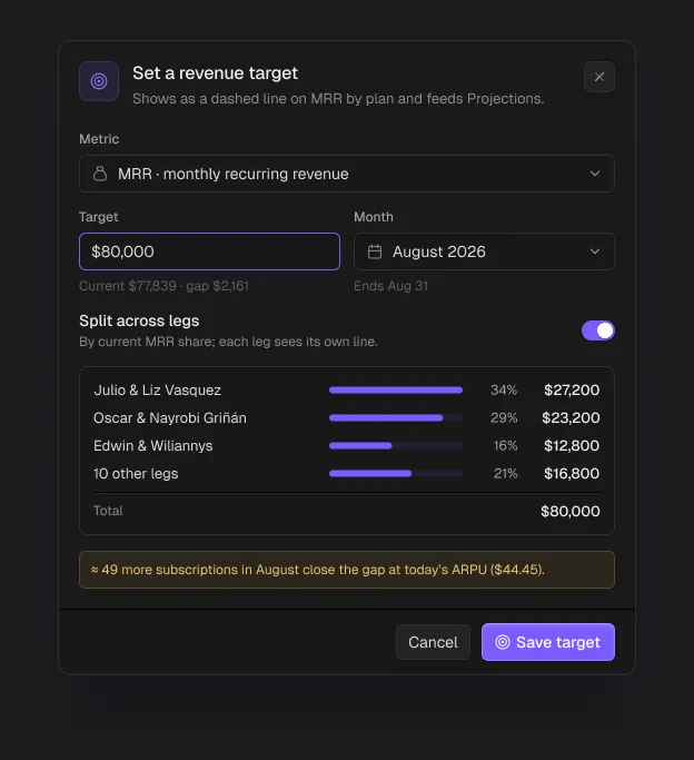
70 screens for business overview, customers, subscriptions, collections, projections, weekly numbers and team processes. What it does well: it pairs every number with a next step. At-risk tables sit next to retention grids, and targets and scenarios can be set from the same screen that shows the gap.
Patterns worth stealing
- Drawers for detail, modals for decisions. Inspect in a drawer; confirm, create and destroy in a modal.
- Row actions in a menu, not five icon buttons per row.
- Settings as a sub-navigation, with security and danger zone always last.
- One accent per system. Status colours are separate from brand colour.
- Copy that names the object. “Pause Customer Refunds?” beats “Are you sure?”.
Frequently asked questions
What makes a good SaaS dashboard?
A clear daily decision on the overview, KPIs with comparisons, a main table with every state designed, detail drawers that keep context, and complete settings, billing and audit screens.
How many screens does a SaaS dashboard need?
More than most teams plan for. The six examples here have between 58 and 81 source screens each once settings, overlays and states are counted.
Can I use these SaaS dashboard examples in my product?
Yes. They are Ingot UI design systems. Loopo is free; the others are part of Pro and Lifetime plans, with components in Figma and, for 1,738 of them, React code.
Where can I find SaaS dashboard inspiration with code?
Each Ingot UI component page shows the Figma original and, where available, React and Tailwind code you can copy or pull into an AI agent through MCP.
About the author
Wolfpixel is the product design studio that designed the six Ingot UI systems from real dashboard projects, and checks every generated React component against its Figma original before it ships. Read more on wolfpixel.agency.