Cards and panels
477 components, 458 with React code
The largest category: content cards, integration cards, settings panels, plan rows, activity feeds and summary panels that fill the space between charts and tables.
Overview gridsIntegrations and connections pagesSettings and billing sections












Every cards and panels component, by system
Loopo70
- Account
- Action, Unsubscribe
- Amount
- Article bar
- Auto top-up
- Balance
- Bank, Chase
- Chat panel, Support
- Composer
- Day grid
- Devices
- Draft note
- Email & automations card
- Exit rule
- Filter chips
- Form cards
- Getting started card
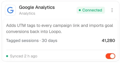
- Google Analytics integration card
- Google Sheets integration card
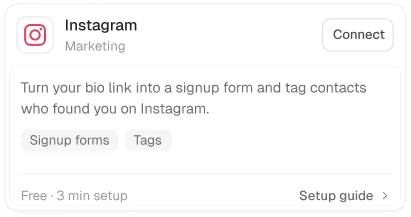
- Instagram integration card
- Link row
- Link row, Cast Iron Skillet
- Loopo balance card
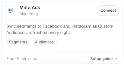
- Meta Ads integration card
- Nav slot
- Next payout
- Next payout card
- Note
- On this page
- Outcome
- Pagination
- Payments & payouts card
- Payout account card
- Payout timeline
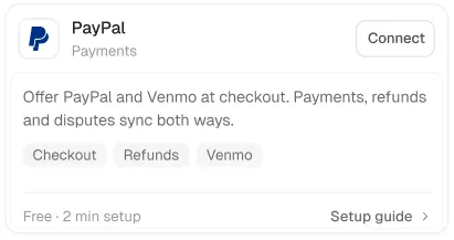
- PayPal integration card
- Plan card
- Plan card, Growth
- Previous payouts
- Products
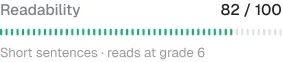
- Readability
- Recent deliveries
- Related card
- Related, Why is my instant payout delayed?
- Schedule
- Schedule cards
- Seats
- Services
- Share card
- Share link
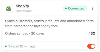
- Shopify integration card
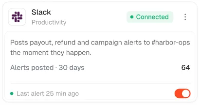
- Slack integration card
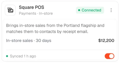
- Square POS integration card
- Still need help card
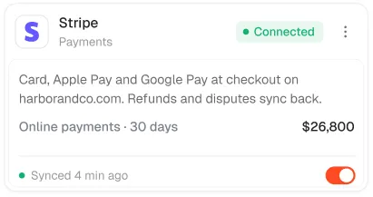
- Stripe integration card
- Suggested card
- Suggestions
- Support team
- Template, Sales tax summary
- Template, Subscription health
- Thread
- Time row
- Usage
- Usage note
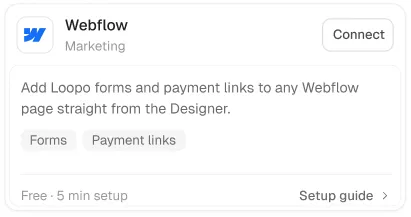
- Webflow integration card
- Webhooks integration card
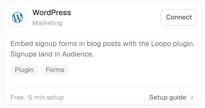
- WordPress integration card
- Workspace
- Workspace identity
- Workspace, W
- Your forms card
MailPulse91
- Account
- Aside
- Assets
- Automation Paid onboarding
- Automation Re-engagement
- Automation Subscription anniversary
- Automation Upgrade nudge
- Automation Welcome series
- Block item
- Block item, Referral widget
- Card Discord integration card
- Card Figma integration card
- Card Google Analytics integration card
- Card Google Sheets integration card
- Card Notion integration card
- Card Shopify integration card
- Card Slack integration card
- Card Stripe integration card
- Card Webflow integration card
- Card Webhooks integration card
- Card WordPress integration card
- Card YouTube integration card
- Cards
- Cards, Monthly performance
- Category Account & billing
- Category Automations
- Category Getting started
- Category grid
- Category Payments & payouts
- Category Sending & deliverability
- Category Subscribers & imports
- Certificate wrap
- Composer
- Controls
- Course info
- Course outline
- Domain card
- Engagement tiers
- Featured course
- Grid integration card
- Grid integration card, Stripe
- Guide grid
- Guides
- Key takeaways
- Lesson details
- Lesson footer
- Lesson pager
- Lessons
- Links
- Messages
- Mode
- Nav item API & webhooks
- Nav item Billing & plan
- Nav item Danger zone
- Nav item General
- Nav item Notifications
- Nav item Profile
- Nav item Security
- Nav item Sending domain
- Nav item Team & roles
- Net
- Next payout
- Options
- Payment method
- Pending invite
- Plan card
- Quick actions
- Reading devices
- Recent assets
- Report bar
- Right column
- Rows
- Rows, Highly engaged
- Rows, Mobile
- Share panel
- Stack
- Stack, Welcome series
- Step panel
- Still stuck
- Suggested
- Support chat
- Support column
- Talk to us
- Template suggestions
- Templates
- Time
- Upcoming live sessions
- Usage
- Video
- Workspace
- Your progress
Auton53
- Access granted
- Approval denied
- Approval granted
- Approval requested
- Approver submenu
- Approver, Arjun Patel
- Approver, Leah Novak
- Approver, Maya Chen
- Approver, Omar Haddad
- Button
- Button, Create custom integration
- Button, Create custom integration
- Button, Read the docs
- Button, Read the docs
- Credential health
- Credential revoked
- Credential rotated
- Density
- GitHub integration card
- Gmail integration card
- Grace
- New events pill
- Option, Draft
- Option, Enforced
- Option, Monitor only
- Pager
- Pager, Previous
- Pagination
- Pagination, Previous
- Pagination, Showing 1–9 of 139 agents
- Policy published
- Presets
- Profile
- Request blocked
- Result note
- Role changed
- Role, Approver
- Role, Owner
- Roles panel
- Rotate confirm
- Save bar
- Save bar, 933
- Save bar, Discard
- Stack
- Stack, 314
- Stripe integration card
- Top
- Top, GitHub
- Top, Notion
- Top, Notion
- Value block
- Workspace, Acme
- Workspace, Acme Staging
Axon31
- Add tile
- Agents
- Button Last seen
- Button Resource
- Button Severity
- Categories
- Indexed records card
- Insight
- Integrity
- Move to submenu
- Open card
- Proposed step
- Role menu
- Row
- Seats
- SSO
- SSO, Single sign-on enforced
- Stack
- Stack, Axon
- Stack, Live data
- Stack, NetSuite
- Stack, Workflows
- Timeline
- Trigger copilot
- Trigger event
- Trigger exception
- Trigger filter
- Trigger run-row
- Trigger sort
- Trigger vendor
- Unsaved bar
Veriq61
- App Checkout widget
- App iOS app
- Break wrap
- Button Block
- Button Block, Start review
- Button Small
- Button Small, Use template
- Card In review 1
- Card PR open 1
- Card Suggested 1
- Card Verified 1
- Credits
- Current step
- Data held
- Eco row
- Exposure
- Findings on node
- Findings so far
- Findings so far, Findings so far
- Gauge
- Languages
- Log
- Node popover
- Pagination
- Path row 1
- Plan row
- Profile
- Progress
- Progress, Step 14 of 22
- Role item
- Role item, Security
- Roles
- Rotation playbook
- Secret value
- Sign-ins
- Simulation proof
- Slack submenu
- Theme
- Ticked meter
- Tile AWS
- Tile footer
- Tile footer, Used by 1.4k teams
- Tile GitHub
- Tile GitLab
- Tile Google Cloud
- Tile Jira
- Tile Okta
- Tile Vanta
- Top
- Top, Critical
- Top, Microsoft Azure
- Unauth row
- Usage
- Usage legend
- VERIQ widget
- VERIQ widget, VERIQ
- Visual
- Visual, Controls evidenced
- Visual, Fixed within SLA
- Visual, Open findings by severity
- Workspace
Vantage171
- Account
- Action
- Activity
- Activity, Activity
- Activity, Activity
- Activity, Activity
- Assumption, Activation
- Assumption, ARPU
- Assumption, Churn
- Assumption, Emerald rule
- Assumption, New customers
- Assumptions
- Assumptions, New customers
- August target
- Billing history
- Bottleneck 1
- By member
- Card menu
- Card menu, At-risk customers · July
- Change, Active subscriptions
- Change, Efficiency
- Change, MG1
- Change, New customers
- Change, Reporting rate
- Changes
- City, La Romana
- City, Punta Cana
- City, San Pedro de Macorís
- City, Santiago
- City, Santo Domingo
- Collection card, At-risk customers, July
- Collection card, Emerald qualification tracker
- Collection card, New member onboarding
- Collection card, Walk-in scripts
- Collection card, Weekly report template
- Column, Done
- Column, In progress
- Column, To do
- Comments
- Context
- Cover
- Cover, 1
- Cover, 38.1%
- Cover, 78.4%
- Cover, At risk · last 12 weeks
- Cover, Edwin & Wiliannys → Emerald
- Cover, JUL
- Cover, Upgrade potential
- Donut
- Donut, $9,341
- Drivers
- Drops
- Edit target popover
- Exceptions
- Filters
- Filters, Plan: All
- Gains
- Gauge
- Heat grid
- Info
- Info, List
- Info, List
- Info, Report
- Insight, Efficiency window
- Insight, Messages per person
- Insight, Oscar & Nayrobi MG1
- Insight, Referrals convert
- Kanban
- Leg filter menu
- Member, Ana Lucía Ferreras
- Member, more
- Member, Ramón Feliz
- Member, Wander Polanco
- Member, Yokasta Rosario
- Meter, Follow ups
- Meter, MG1
- Meter, New customers
- Meter, Positive messages
- Meter, Reports in
- MG1 by week
- Minimap
- Mover, Alberto & Ciany
- Mover, Domingo & Alejandra
- Mover, Enmanuel & Suseidy
- Mover, Fredis & Yanelis Paredes
- Mover, Jonathan Rondon
- Mover, Oscar & Nayrobi Griñán
- MRR section
- Name
- Node, Alberto & Ciany
- Node, Carlos & Erody
- Node, Carlos & Stephany
- Node, Domingo & Alejandra
- Node, Edwin & Wiliannys
- Node, Enmanuel & Suseidy
- Node, Fredis & Yanelis
- Node, Jonathan Rondon
- Node, Oscar & Nayrobi
- Node, Root, Luis & Jackie
- Node, Ruben & Maria
- Node, Saul Santana
- Not reported
- Note
- Notes
- Oldest waiting
- Opportunity
- Outcome
- Owner
- Payment method
- Payments
- Payout row
- Payout schedule
- Plan mix
- Plan rows
- Plan rows, Essential · $29
- Plan rows, Essential · $29
- Pool legend
- Properties
- Rank, Diamond
- Rank, Eagle
- Rank, Emerald
- Rank, Platinum
- Reason, Moved away
- Reason, Not using it
- Reason, Other
- Reason, Price
- Reason, Switched provider
- Reasons
- Renewal
- Renewals
- Reports
- Req, Active subs
- Req, MG1
- Req, Qualified legs
- Risk reasons
- Row menu
- Seats
- Share report modal
- Share submenu
- SLA popover
- Slider, ARPU
- Slider, Churn month
- Slider, New customers week
- Sliders
- Source legend
- Split bar
- Stage head, Follow up 2+
- Stage head, MG1, first meeting
- Stage head, New customers
- Stage head, Positive messages
- Submit my week modal
- Suggested actions
- Suggested actions, Suggested actions
- Suggestion
- Summary
- Target meters
- Task
- Task Done
- Task, Book MG1 · Wander Polanco
- Text
- Text, Opportunity
- Ticked meter
- Top
- Top, Step 1
- Total row
- Value row
- Week notes
- Week picker popover
- Week row
- What changed
- Workspace switcher
Questions
Why so many card components?
Each was harvested from a real product screen, so cards come in the shapes products actually need rather than one generic card with slots.
Can I change the colours?
Yes. Every component reads the system tokens, so switching the token file changes the whole look.