Modal vs drawer: when to use each in a dashboard
By Wolfpixel2 min read
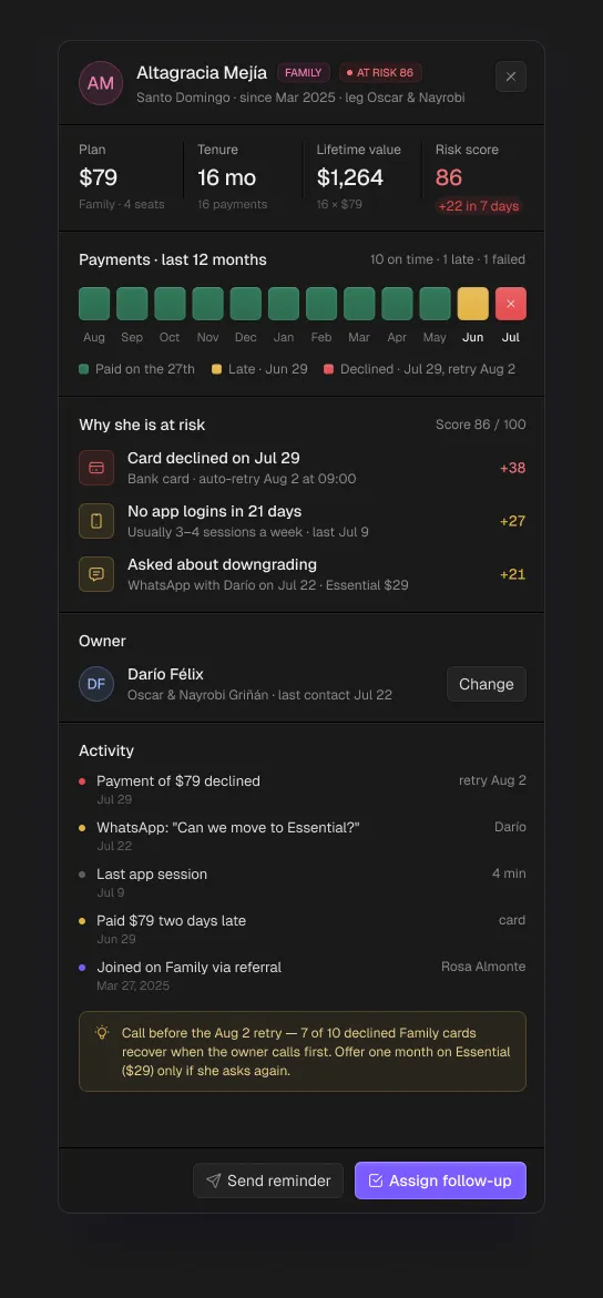
Use a modal when the user must make a decision before continuing: confirm, create, connect or delete. Use a drawer (side panel) to inspect or edit one record while keeping the list in view. Use a popover for small optional controls tied to one element, and a full page when the task is long or needs its own URL.
Summarize withChatGPTClaudePerplexity
On this page
We are Wolfpixel. The six Ingot UI systems contain 241 modals and 100 drawers, which gave us a lot of real cases to test this rule against. It holds up.
The rule in one table
| Pattern | Use it for | Blocks the page? | Example |
|---|---|---|---|
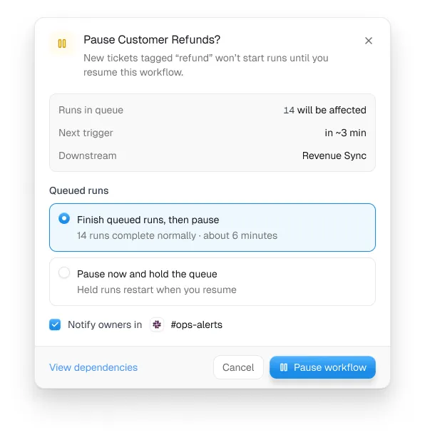
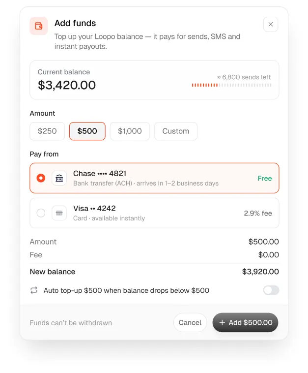
| Modal | A decision: confirm, create, connect, destroy | Yes | Pause Customer Refunds? |
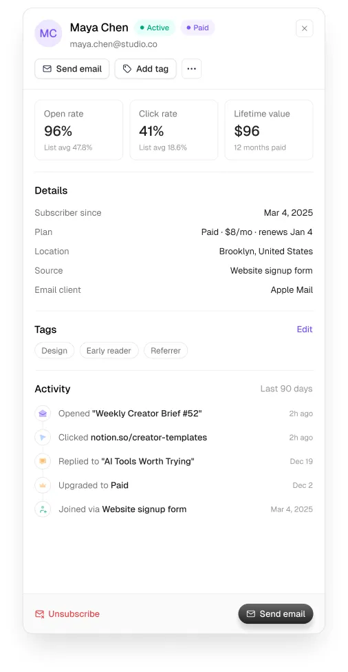
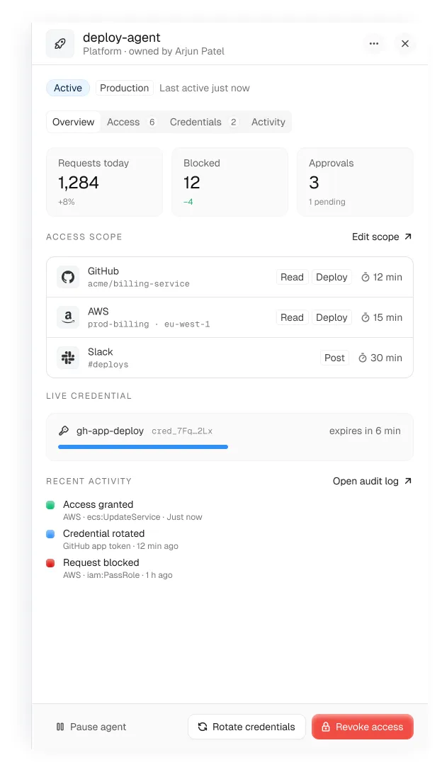
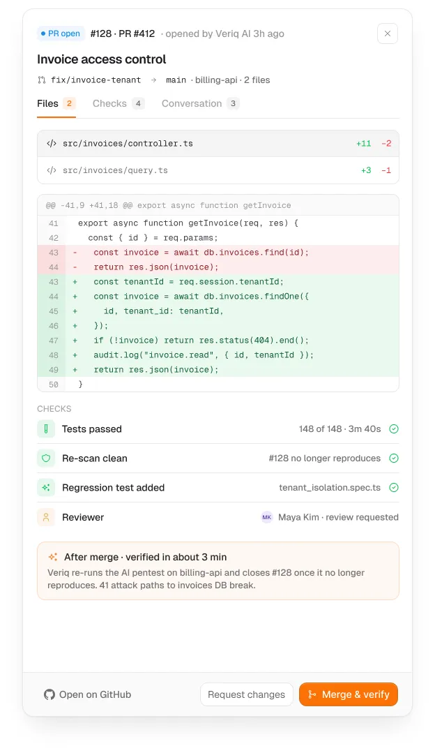
| Drawer | Inspect or edit one record from a list | No, list stays visible | Subscriber profile drawer |
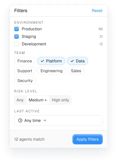
| Popover | Small optional controls on one element | No | Filter popover |
| Full page | Long tasks, things people link to | Not an overlay | Settings, builders, reports |
When a modal is right
- The action is destructive or hard to undo.
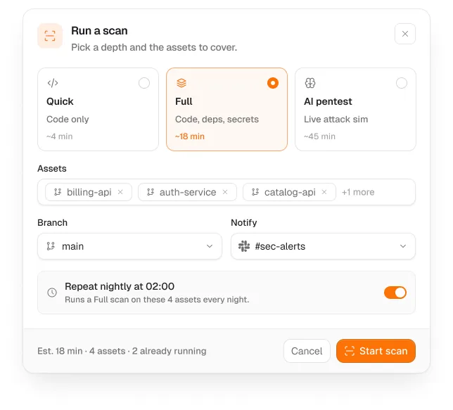
- The form is short (one to five fields) and creates something.
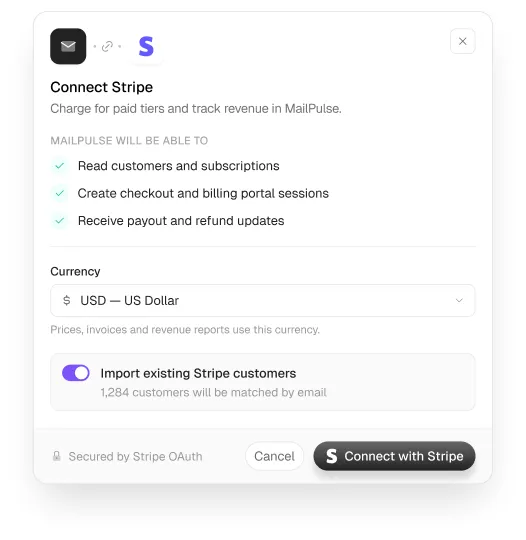
- Connecting an integration needs consent before continuing.
- Name the object in the title and the button: “Delete 3 segments”, not “Are you sure?” and “OK”.
When a drawer is right
- People open records one after another from a list and need to keep their place.
- The content is long enough to scroll but doesn’t need its own page.
- Light editing happens in context (status, owner, tags).
- Give the drawer a URL (
?id=) so it can be shared and survives a refresh.
Mistakes we see most
- Record detail in a modal, so people close it, scroll and open the next one.
- Modals that open modals.
- Long multi-step forms in a modal; make it a page.
- Drawers with no close on Escape or no focus management. Base UI handles both.
- Confirm dialogs for every action, which teaches people to click through them.
Mobile
On phones, a drawer becomes a full-screen sheet and a modal becomes a bottom sheet or a full-screen step. Keep the same rule: decisions block, records don’t.
Frequently asked questions
What is the difference between a modal and a drawer?
A modal blocks the page until the user makes a decision. A drawer slides in from the side to show or edit one record while the page behind stays visible.
Is a side panel better than a modal for forms?
For short create forms a modal is fine. For editing existing records from a list, a drawer keeps context and is usually better.
Are modal and drawer components accessible?
They should trap focus, close on Escape and return focus to the trigger. Ingot UI uses Base UI for these behaviours.
About the author
Wolfpixel is the product design studio that designed the six Ingot UI systems from real dashboard projects, and checks every generated React component against its Figma original before it ships. Read more on wolfpixel.agency.